Blog — Christchurch Archaeology Project

Jessie Garland

Gendered marketing: so terrible it's funny, until you think about it properly

A short post in honour of International Women’s Day (which was on Friday, but eh, still relevant).

There are several ways that we can find the stories of women’s lives through material culture, from the way that women are depicted on artefacts, their choices and tastes as consumers and, most pertinent to this post, the way that they are framed as a consumer market through advertising. Advertising can be its own form of social commentary, drawing attention to – often over-inflated or sensationalised – contemporary assumptions about people’s worries, cares, likes and dislikes and daily habits. It can also be terribly funny or simply just terrible and I have absolutely no doubt that people will be saying the same thing about our advertising culture 150 years from now.

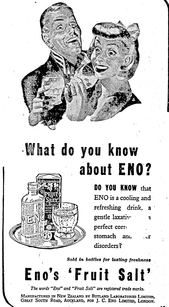
Not relevant to anything in this post, but genuinely one of my favourite historic advertisements. Their eyes, dear god, their eyes. Image: Otago Daily Times 24/08/1950: 9).

We have many examples of products marketed to women that come up in the course of archaeological research (often these are just incidental adverts that come up when looking for something else, like how too much salt and too much jealousy might cause the bust to ‘fall ’; Pelorus Guardian and Miners’ Advocate 25/03/1898: 6). The one I’d like to talk about today is a ‘medicated’ tonic wine from the early twentieth century, specifically a brand called ‘Vibrona, The Ideal Tonic’, a bottle of which was found on a site in Hereford Street. Vibrona, along with other tonic wines, was marketed to women (particularly middle-class women), through women’s magazines and through repeated reference to its aid in alleviating ‘female complaints’ – a generic term that referenced everything from menstrual pain, breastfeeding pain, post-natal health issues and “maternity weakness”, to general lethargy and nervous disorders (Loeb 2020; Thames Star 17/07/1909: 4; National Library of Medicine 2024). Even when women, or their complaints, weren’t referenced by name, women’s faces were still used in the advertisements, making the intended customer base very clear (Timaru Herald 21/10/1935: 10).  

Feeling saggy? Image: Timaru Herald 21/10/1935: 10.

These tonic wines could be up to 15-20% alcohol, higher than most non-fortified wines today, but their ‘medicated’ label deliberately misled consumers into thinking that the harmful aspects of the ‘wine’ had been removed (Loeb 2020; British Medical Journal 29/05/1909: 1307-1309). Rhetoric of the day included accounts of teetotallers being duped into consuming alcohol thanks to the medicated moniker (Loeb 2020). In this, tonic wines were similar to many patent medicines and remedies, which also claimed curative properties but could primarily be composed of alcohol (perhaps with some herbs and sugar as a disguise). Apparently, tonic wines themselves contained a range of ingredients alongside the alcohol, from beef extract, malt extract and cocoa leaves to quinine and cocaine (were you expecting cocaine to round out that list? In my experience of late nineteenth and early twentieth century medicines, you should quite frequently expect cocaine…; Loeb 2020; BMJ 29/05/1909: 1307-1309). Vibrona itself seems to have contained chinchona bark, from which we get quinine, the anti-malarial. A British Medical Journal analysis in 1909 suggested that Vibrona did contain a small proportion of chinchona bark (alongside almost 20% alcohol, but with the quinine itself removed – although this was disputed by the manufacturers the following month (BMJ 29/05/1909: 1307-1309; 19/06/1909: 1491). The English manufacturers, Fletcher, Fletcher and Co., did advertise Vibrona as a good option for those customers who normally got a headache from quinine. Read into that what you will…

Tonic wines were subject to campaigning by temperance organisations in the early twentieth century, due to their misleading nature and the grey areas they occupied in British legislation about alcohol, which allowed medicated alcohol to be sold without a license. Temperance campaigning was also heavily based on a stated desire to protect women from their harmful effects (Loeb 2020). It was this last motivation that came to frame much of the narrative of their campaign: however much weight the other reasons for opposing the unlicensed sale of tonic wines had, it was their harm to women – and the need to protect women – that was chosen as a fundamental thread by which public and professional support for their regulation or prohibition might be generated. This narrative included “the spectre of female teetotallers soaked in liquor, dirty and lying in the gutter” (Loeb 2020: 16) and the framing of some women as gullible and easily misled into alcoholism by the recommendation of profit-driven chemists and druggists. It is worth noting here that the impact of alcoholism on women was a core tenet of the temperance movement, particularly the impact of men’s alcoholism on women’s lives – we can see it here in New Zealand history with the famous example of the Women’s Christian Temperance Union, which played a key role in achieving women’s suffrage in 1893. The impacts of alcoholism on women in general during the nineteenth century were very real, and the efforts of temperance campaigners to minimise this were anchored in a desire, that I am personally very grateful for, to materially and politically improve the lives of women for generations to come. That said, I think there are some interesting impressions to be taken from the story of Vibrona – and tonic wines – in particular, that show some of the different ways that we can read attitudes towards women in the past and the ways we have to be careful about using historical sources to do so.

A letter to the editor, written in 1898 by Fanny Cole, president of the Women’s Christian Temperance Union in the early 1900s, framing the ‘no license’ issue in terms of its impact on women, taken from the And yet, she persisted’, blog post on Christchurch Uncovered. Image: Press 28/11/1898: 2).

To start with, marketing a medicated alcohol – a fairly generic remedy, when all is said and done – as a solution for the catch-all diagnosis of “women’s complaints” suggests to me an understanding of the consumer power of women, especially – in this case – middle-class women, but a lack of knowledge or interest in their health and all its variation beyond that generic grouping. This is not an uncommon refrain – we are still, today, reckoning with the way that women’s health issues have been ignored or generalised by the medical and pharmaceutical industries. It is also worth acknowledging that framing women as a consumer market is not just a positive recognition of women’s power as consumers – it also allows them to be forced into a somewhat narrow consumer stereotype, subject to the expectations of a patriarchal society (anyone else who has issues with the gendered lines of cosmetic and perfume marketing will know what I mean). Marketing along gendered lines, for both men and women, is very much about tapping into stereotypical and generalised expectations of what it means to be either in this society and, by doing so, it often reinforces those gender stereotypes back to us, thereby increasing their efficiency as a marketing technique (if you can’t tell, I’m a bit cynical and very irritated by this).

How DOES she stay so young? Also, I find the claim of “delicious wine” to be a bit suspect. Image: Jennings and Keers 2018.

On the other side of the tonic wine example, we also have the temperance movement’s use of the damsel in distress narrative when it came to policing the consumption of products like Vibrona, playing on attitudes towards women as people in need of protection, weak willed and gullible (check out Loeb 2020 for a much more nuanced discussion of this). This is where the danger of looking at history through the eyes of advertising comes in. Women are no more in need of protection, no more inherently weak-willed or gullible than any other gender, not now and not then. What we (and everyone else!) are in need of is enfranchisement and empowerment, to be valued and respected beyond the constraints of gender. It is no coincidence that this is part of where the temperance movement in New Zealand did lead, towards women’s suffrage and the ongoing fight for gender equality.

So, while using advertising and consumer culture as an insight into social attitudes and social commentary is interesting and can be really useful, it is by no means without its own biases and cannot be used uncritically. Always question the rhetoric. I want to end by acknowledging that working in a field that spends a lot of time researching the past can sometimes be a bit of a slog if you’re a woman (or a person of colour, or LGBTQ+, or any of the other groups of people that have historically suffered, been diminished and oppressed). It’s a little bit of an exercise in rolling your eyes, laughing at the more outlandish claims and learning how to moderate the frustration and anger and sadness and solidarity that inevitably strikes when you remember the actual women living with it all.  I can only hope we do them justice.

Jessie


References

British Medical Journal 1909. Online, available https://www.bmj.com/content

Jennings, C. and Keers, P., 2018. ‘The wines that made us (4): Sanatogen’, in Sediment. Online, available at https://sedimentblog.blogspot.com/2018/02/the-wines-that-made-us-4-sanatogen.html

Loeb, L., 2020. ‘Desperate housewives: The rise and fall of the campaign against medicated wines in twentieth-century Britain’, in Pharmaceutical Historian, Vol. 50(1): 16-25. Available at https://www.ingentaconnect.com/content/bshp/ph/2020/00000050/00000001/art00002?crawler=true&mimetype=application/pdf

Tapping, R. 2017. ‘Tonic wine’, in AJP: the Australian Journal of Pharmacy, Vol. 98, p. 16.

An issue of scale

I’m going to attempt the impossible today. Unlike Alice, I’ve already had my breakfast, so hopefully that’s all we need to make it possible. Let’s talk about the CAP database and – this is the impossible bit – I shall do my very best to make a blog post about a designing, compiling and populating a database of interest to more than data nerds like me…

As a child, I thought I was Alice. As an adult, I am increasingly, painfully aware I’m the white rabbit, stressed and constantly running late. Image: Sir John Tenniel, public domain, via Wikimedia Commons.

 For those who are unaware, the Christchurch Archaeology Project is currently working on a somewhat ambitious project to take all the information – histories, archaeological data, artefact records, etc. – gathered from archaeological work in Ōtautahi since the earthquakes and make it freely available to everyone through a huge database and website. We got funding for this from Manatū Taonga, which was amazing, and have been spending the last few months designing and building it, with the assistance of the wonderful people at Intranel. It’s a hell of an undertaking, to be blunt. There have been several occasions on which my brain has – for lack of a better work – ‘blue-screened’, but we have persisted and, honestly, what we’re managing to create is so cool. I can’t wait for you all to see it properly. 

My brain, some days.

 As we’ve talked about before, here on the website and in previous blog posts, the scale of archaeological information recovered from Ōtautahi Christchurch since the earthquakes was unprecedented in many ways, not just because of the number of artefacts found or the number of archaeological features excavated, but because of the sheer variety and scope of the sites, projects and material culture excavated. Archaeology in Christchurch since 2011 has extended across most of the city’s urban landscape, uncovering evidence of so many different aspects of the city’s history and development. The concentration of this work over such a short period of time has also really highlighted the inter-connected nature of the archaeological and historical landscape, as we encountered the same people across multiple sites, found similarities and differences in the archaeology of different parts of the city and saw patterns in land ownership, urban development and the city’s built heritage. At the same time, however, the data itself exists in disparate, separate datasets – the city has been excavated site by site, project by project as the post-earthquake recovery necessitated archaeological investigation bit by bit. We’ve seen those connections and patterns in what seems like fleeting glimpses – we know they’re there but we can’t easily tease them out until we have all of the information in one place, accessible and searchable. Perhaps more importantly, this information belongs to the city – all this archaeological work has uncovered a rich history that belongs to the past, present and future residents of Ōtautahi Christchurch, to the people who live here, who have lived here, whose ancestors lived here, none of whom can currently access it with any ease.

I tried to manually map connections for a set of sites once. It did not go well, given the file name of this image is ‘political flowchart of doom’. Image: J. Garland.

 To really get your head around the project and what we’re doing, it helps to think about scale and the ways that we frame stories, especially stories of people and place. Here, although archaeological work in Christchurch has occurred on a site-by-site basis, what we really have in the end is an archaeology of the city, the story of the city as a whole told through the stories of its people, its places and its material culture. It’s just like the city itself, really. Christchurch, like all places, has an identity that is formed by its history, by the landscape, the cityscape, the community and the ideas that the residents and non-residents alike have of who the city is. I’ve always thought about cities as people (I’m not alone in that, if anyone has read N. K. Jemisin’s work, for example), individual entities with personalities and atmosphere and a sense of something that is more than the sum of their parts.


When you frame a place like this, as one big entity instead of a whole lot of individual components, there are details of that place that fall out of focus, because they matter less at this perspective – for example, each of the suburbs of Christchurch also have their own distinct personalities (sometimes this goes down to the street level!), but these become overshadowed by the city when we consider it as a whole. Similarly, there are aspects that come into focus more when viewed from the broader perspective – we see more of the connections between places, more of the similarities and shared characteristics, the things that make the city distinct, especially when compared to other cities.


I think of the database in a similar way. We are broadening our perspective on all the archaeological information generated by our work here over the last decade, to better enable us to see the connections and find the shared characteristics of the city’s archaeology and history on that large scale. We are also, however, also making sure that if we want to look at the small scale, we can – the details that can be lost at the large scale, like individual people, sites, single artefacts or specific archaeological features, are all still there for us to find if we want to. Essentially, we’re using the database to do what a human brain struggles with – to hold all of this data at the same time, so that we can move between perspectives to explore the city’s history at whatever scale we like.

Each of these artefacts has so many stories to tell, from so many different perspectives. Image: J. Garland.

 My job has been to try and create a network of information that lets us do this, finding the connections between the different types of data generated by the archaeology of the city and trying to be sure that we have enough detail to showcase the individuality of sites and people and archaeology as well as enough standardisation, ways of grouping data and ways of filtering information to also showcase the similarities and connections between all of this. I won’t go into the specifics of this (but it will all be available on our website in the end, so you can go and trawl through it if you really want to!), because, quite honestly, it’s a LOT. It has broken my brain on more than one occasion.


Our wonderful CAP team – Sayali, Sam, Ebony and Madi, thank you! – have been going through archaeological reports produced since the earthquakes and pulling out information to be entered into the database and website. It has been something of a crash course in Christchurch’s history and landscape for them, not to mention a journey of discovery through all kinds of archaeological finds and historic stories. To date, they’ve entered information on more than 800 places (land parcels, subdivisions, surveyed sections), almost 1500 people, 300 organisations and buildings and have teased out almost 2000 connections between those people and those places. We’re recording the connections between people as well, from the familial – brothers, sisters, mothers, fathers, cousins – to commercial and social connections, like who employed who. In one memorable case, we even have a criminal connection between someone who crashed his cart into someone else in 1900. These people and places and organisations are all then linked – when possible! – to our archaeological data, to the artefacts and the sites and the archaeological features, slotting each of those jigsaw pieces in next to each other to form a more complete picture of the city’s story. We already have detailed records of almost 2000 archaeological contexts (things like rubbish pits, layers, wells, brick features, bridges, cellars, drains, tram tracks, road layers, underfloor deposits, postholes, even an animal burial!) and with those contexts, the records for more than 18,000 artefacts (44,000 fragments) ready to be made available online to anyone who wants to look at them. If those numbers don’t seem like a lot, I promise they’re growing rapidly, but maybe a better way of conveying the scale is that across all the different records and datasets, the team has recorded 140,000 pieces of information (not including the artefacts), from feature measurements to the marital status of early Christchurch residents to who analysed and excavated what. 

When I looked up His Lordship’s Larder (see next paragraph), I thought I would get advertisements for the business, maybe some shenanigans at the hotel, not this. Image: South Canterbury Times 12/03/1886: 3.

 I’m going to leave you today with a handful of stories and bits of information that have stood out to the team as they’ve been working through all the data. My personal favourites (except for all the artefacts, obviously) are the interesting names people used for their businesses. Did you know there was a hotel in Christchurch called “His Lordship’s Larder Hotel”? Or that there was another one called the “Robin Hood Inn”? I will also never forget the story of J. Hare, poor person, the inquest into whose death recorded that he had “died by visitation of god”. Your guess is as good as mine, there.

Lyttelton Times 14/06/1864: 6.

 One of the team loved the story of Charles Cox, who was involved in shoe polish fraud from his Harvey Terrace section, a crime for which we found archaeological evidence. There was also the story of James Lee Goon, a Chinese boarding house proprietor who was arrested as a brothel keeper in the 1890s, at the same time as a lot of anti-Chinese sentiment was prevalent in New Zealand. We’ve come across prominent figures in their everyday lives, such as Julius Von Haast and his family renting a house on Armagh Street in the 1880s, and common place materials in unexpected situations, like the use of clinker (metalworking waste) in roads and landscape modification. There have been great artefacts (time capsules!) - one of our team mentioned that she’s coming to realise that there are quite a lot of cool belt buckles in nineteenth century Christchurch – and aspects of life in the historical city that hadn’t been considered, but make sense when you think about it, like the number of cart-on-cart accidents and subsequent arrests. Dangerous driving, it’s been a thing for much longer than you’d think. And, perhaps unsurprisingly, everyone working on the project has come to have that duality of vision that happens to anyone who works with or learns the history or archaeology of a place, simultaneously seeing two cities around them as they live in the Christchurch that is and work with the Christchurch that was.

An sinister snake buckle. Image: Maria Lillo Bernabeu.

Two 1920s time capsules from the foundations of the Nugget Boot Polishing Factory on Ferry Road and an account of some cart related crime. Image: Andy Dodd (left) and Star 22/05/1902: 3.

 This is just a tiny taste of what this project will be. I could write a whole post just listing the research potential of a dataset like this. Every day, the team are adding more and more data and we will eventually have something fantastic that will, I hope, allow any of us to see these stories whenever we like, with whatever framing we prefer.

Jessie

By any other name: shop edition

As any student of mythology knows, names have power. They carry stories and identities, not just for people, but for buildings, organisations and places (among others). As Kat discussed a few weeks ago, the names given to houses can tell us a great deal about the people who named those houses and the culture and society of their time. It’s not just houses, though – commercial names also have stories to tell and can reflect wider social trends or cultural events in their branding. We can see this in contemporary company names as well as historical ones – for example, a lot of the big brands of today have short, single word names, many of which are unrelated to the product or service being sold or the people behind the company (hi, Apple!). There are considerations in the way companies are named now that are specific to this era of history – for example, names that are easily found by search algorithms on the internet (not something nineteenth century businesses had to consider). Company names can also be part of the social or cultural zeitgeist of the time, like, apparently, a fad for vaguely space-sounding company names after the launch of the Sputnik 1 satellite in the mid-twentieth century.

In nineteenth century Christchurch, there were all sorts of names for businesses and organisations. Some of them are amazing – I refer you to the friendly societies (you can thank me later), my favourite of which was the Royal Antedilvuian Order of Buffaloes, until I saw that there was a Ye Anciente Order of Frothblowers. There were definitely chapters of the Buffaloes in Christchurch, with the Royal Pythagorean Lodge and the Royal Jubilee Buffalo Lodge meeting in the 1880s. Unfortunately, and I am genuinely disappointed by this, I have found no trace of the Frothblowers in the city.  

Businesses were perhaps a little less flamboyant in their names than friendly societies, but there is still information to be gleaned from their branding. I think this is particularly true of shops, the focus of today’s post, especially when we consider them in the context of our own relationship with consumer culture. Shops are like people, in a way – they have personalities, they have reputations, they vie for our attention and participate in performing an identity just like people do. There was even a ruling in the USA about companies being people, remember that? In all seriousness, though, consumers can have properly personal relationships with retailers (enhanced by their marketing!), relationships that involve loyalty and attachment and genuine sadness when a shop ceases to exist (the thing, of course, is that shops – and companies in general – cultivate and use that relationship to sell goods and services and cannot necessarily reciprocate those feelings of loyalty and attachment beyond the profit margin...). Identity is absolutely a key component of branding, especially in an area of commerce that needs to interact with actual people in order to be successful. Names are a big part of this, as one of the entry points to that personality the shop is trying to convey.

From the shops I’ve come across through my thesis research, which looks specifically at the supply and retail of nineteenth century household goods in Christchurch, there are three main trends in naming that have become apparent: ‘house’ names, proprietor names and what I’ve been colloquially referring to as ‘story names’. Fair warning, this is by no means an exhaustive list – it is very much just what I’ve come across from working with the archaeology and, specifically, with shops that retail household goods and fabrics. There may well be trends among other types of retailers or businesses that I’m not addressing here.

House names

This became particularly apparent when I started researching glass and china shops in Christchurch, in part because of the large number of shops – and archaeology – found on the site of Te Pae. One of these was a fancy goods store from the 1860s and 1870s called London and Paris House, which reminded me of another Tuam Street glass and china store from the 1880s known as Windsor House. London and Paris House, which began life as a drapers under the Misses Ellis in the late 1850s, could be explained as a call-back to the phrase “the best London and Paris Houses” or “the fashionable houses of London and Paris”, which appear in newspaper advertisements for clothing and fabric at the time (Lyttelton Times 17/11/1863: 6; Star 20/01/1894: 4). Windsor House, however, didn’t quite have the same association, nor did (brace yourselves..) Albion House, Granite House, Leamington House, Bradford House, Argyle House, Paris House, Glasgow House, Cashel House, Leeds House, Whately House, Hertford House, Yorkshire House, Regent House, Criterion House, Sydenham House, Waterloo House, Victoria House or Dunstable House.

A selection of artefacts from London and Paris House, 1862-1873, when it was under the proprietorship of Henry Leake. Leake took over the London and Paris House drapery established by Miss Ellis and Miss Ellis in 1859 and turned the brand into a fancy goods store. It continued to be a fancy goods store under Thomas Pillow, who took over from Leake in 1873, until 1876 (Lyttelton Times 28/01/1873:), when a man named Fountain Barber took over the premises, but got rid of the brand name (Lyttelton Times 8/12/1876: 1). Image: Jessie Garland.

Most of these reference place names, many of them also famous British places, packaged in a ‘house’ format that presumably evoked a certain stateliness and social standing. The connection to the ‘old country’ is also implicit, reminding European colonists of a part of the world that they would have associated with good taste. Most of these shops were also drapers or tailors and we can still see that naming convention in the modern fashion industry – people still refer to ‘fashion houses’. I do wonder if there was also an association – deliberate or not – with nobility and gentry implied through the use of the format, where ‘houses’ imply legacy and lineage and old establishment, reinforced by reference to historic, grand British places.

Perhaps this is what the fancy goods stores were also going for, no matter how else they marketed themselves. Windsor House, for example, was the work of C. C. Banks, easily the most creative marketer I came across in my research – as well as advertising his shop as the cheapest in Christchurch (Star 7/03/1881: 2), Charles Banks also capitalised on a local murder mystery-turned insurance fraud saga to suggest that the “finger of the severed hand pointed towards Windsor House” (Star 21/01/1886: 2).

Would this advertisement get you through the door? Star 21/01/1886: 2.

Proprietor names

Alongside the house names, there were also shop names that used the names of the proprietors and/or business owners as the brand name. Unlike something like Windsor House or London and Paris House, which relies on a cultural connection to something outside the business, proprietor names relied on the association of the shop with the person behind it, putting their reputation and involvement into the identity of the brand. This should be familiar to all of us – we still see this a lot especially with non-retail companies, although a little less than we used to, perhaps, because of other trends in branding. Here in Ōtautahi, we still have Ballantynes (J. Ballantyne and Co.), Smith’s City (Henry Cooper Smith) or Bunnings (Arthur and Robert Bunning).

In the nineteenth century, we had so many. Some of the ones we have archaeological evidence for are Gould and Miles (a general store), Sheppard and Co. (also a general store) and Dallas and Co. (auctioneers), all of them present on the site of what is now Te Pae. These names are stories of partnerships as well as people – for example, George Gould and Grosvenor Miles opened their shop on Colombo Street in 1854, a sequel to the shop George Gould had opened on Armagh Street in 1851, the first in Christchurch (Lyttelton Times 10/05/1851: 1; 1/07/1854: 3). They were succeeded in 1865 by Sheppard and Co., a partnership between Walter Sheppard (husband of Kate) and George Piercy (Lyttelton Times 12/08/1865: 1; 8/03/1866: 3). This partnership dissolved in 1875 and the shop once again changed its name, this time to George Piercy, Grocer (Press 1/07/1875: 4). Shops branded with the names of their proprietors are unsurprisingly more likely to change as the people do (although not always!). By contrast, London and Paris House had a succession of three proprietors and a change of wares, all under the same name.

A selection of 1850s-1860s artefacts from the stores of Gould and Miles and their successors Sheppard and Co., found on the site of what is now Te Pae. Image: Jessie Garland.

Story names

And then, there are the shops that grow their own names. For example, in 1860, a man named John Younghusband opened a small shop on Colombo Street. It was primarily a stationer’s shop, but he also sold toys and books and hosted a circulating library. The shop was tiny, sandwiched between other, larger buildings. When first advertised, it carried the grandiose name of “John Younghusband’s Fancy Emporium”, which was perhaps too large a name for such a small building (Lyttelton Times 1/12/1860: 7). Within a couple of years, it had instead become “that well-known little shop at 9 Colombo Street” and by 1863, it was indisputably named The Well-Known Little Shop, a truly Dickensian name that was perhaps a little easier for the shop to bear (Press 29/11/1862: 7; Press 23/11/1863: 1). Notably, if we’re thinking about the impression of identity that is performed through shop names, there is quite the difference between Well-Known Little Shop and John Younghusband’s Fancy Emporium. Not necessarily better or worse, but certainly different.

A selection of artefacts from the Well-Known Little Shop. John Younghusband lived on the same section as the shop with his family, so this assemblage is a mixture of discarded stock from the shop and the domestic material culture of their household. Image: Jessie Garland.

I’ve barely scratched the surface here – these are shops and shop names whose stories have been revealed through the archaeological work carried out in the city. There will be many, many more types and trends in the naming of nineteenth century commercial establishments – I haven’t even touched on the bazaars and barely talked about the emporiums. And don’t even get me started on the naming of hotels. Perhaps this is something we can revisit when the database is finished and we can do a more thorough analysis of businesses and the various ways they presented themselves to the consumer.


It is interesting, though, to think about names in the context of commerce and especially in context of consumerism, as we are being sold the goods under the umbrella of the name. There are so many factors that influence our choices as consumers and the performance of retail identity is an inescapable one. We are not immune to marketing and curated experiences, no matter how much we think we are, even when that performance is just in a name. Perhaps it’ll be something you think about as you do your Christmas shopping in the next few weeks – where do these names come from and what are they trying to evoke in us? Are they conjuring a suggestion of a place in the world, of a style of life, of a particular status, or a trustworthy personal connection? What stories do those names tell and how much have we been listening without even realising?

 Jessie Garland


Ink-credible inks

This past week (let’s be honest, this year) has been a bit chaotic, work-wise, so it’s another blog post of artefact photos from me. Hopefully, in the next post I write, I’ll be able to give a bit more of an update on the database project and what we’re up to, but that day is not today. This week, because I’ve been doing a lot of writing and scribbling with pens and pencils, I’ve decided to showcase writing implements, particularly ink bottles. Most of us don’t use ink for writing as much as we used to and, thanks to the ballpoint pen, we certainly don’t require ink in the same format as our ancestors did. The ink bottles used by people in the nineteenth and early twentieth century came in a range of forms and sizes, but can be separated broadly into inkwells - that is, small bottles into which the pen-nib was dipped directly - and larger, ‘bulk’ ink bottles, used to refill these smaller bottles and inkwells. As an artefact of daily life, they are an indication of literacy, although not the only one. From the marks and names on the bottles, we can see the trade relationships to Britain and Europe and learn something about developments in ink manufacturing; from the shapes, we can learn about changes and innovations in glass-making during the nineteenth century.

A small circular inkwell with black residue still visible inside the bottle. This was found on the site of the old Occidental Hotel and could have been used by a hotel staff or a guest staying there. Image: Maria Lillo Bernabeu.

Penny ink bottles! So called because of their price, these are a very common find on nineteenth century archaeological sites in Christchurch (and New Zealand). Image: Jessie Garland.

P. and J. Arnold were British based manufacturers and exporters of ink during the nineteenth century. Their company had its beginnings in the early eighteenth century under another name and, by the nineteenth century, they were producing up to 30 different kinds of ink that were sent around the world. Image: Jessie Garland.

These delightful little bottles are known as ‘boat inks’ by collectors, although you might have to squint to see the resemblance to a boat. They’re notable for the grooves along the shoulder of the bottle, which allowed the user to rest their pen on the bottle without it rolling off. Image: Jessie Garland.

A cone ink (otherwise known as a “ring cone” or “cone carmine”). The inspiration for the name is a little more obvious here, given the distinctive shape, while ‘ring’ refers to the ring of glass on the shoulder of the bottle. This was found in association with an 1890s-early 1900s burn layer on a site on the west of the city. Image: Chelsea Dickson.

A beautiful wee octagonal ink bottle. This has the crude “burst-off” finish characteristic of these bottles, which were cheap and easily made. This one is from a c. 1880s context in the central city. Image: Jessie Garland.

A tiny square ink well with a slightly uneven base (this would not have stood flat on a desk!). I love that you can see the uneven cavity of the inside of the bottle through the side - how the glass pools in one corner but thins in the other. Image: Jessie Garland.

Another very predictable name - this is what’s known as a “bell ink”, although the bell shape is not so distinctive in this example as it might be in some others. This was found in a c. 1860s-1870s collection of rubbish deposited into a central city gully channel. Image: Jessie Garland.

An ink bottle shaped like a shoe! Why not. Image: Jessie Garland.

I love this bottle. This is what’s known as a churchwarden ink bottle, most commonly associated with red ink and identifiable from the distinctive square finish (or top). This was found on a site in Lyttelton, although we can’t associate it with any one business or household. It was made by Doulton and Co., Lambeth, potters well-known for their stoneware bottles and jars. The registration mark on the side dates its production to some time after 1876. Image: Jessie Garland.

French ink! It wasn’t just English inks and ink bottles exported to colonies like New Zealand. Several of these bottles, which bear the mark of Antoine et Fils (Antoine and Son) ‘L’Encre Japonaise’ (Japanese Inks), have been found throughout the city in deposits dating to the 1870s and 1880s. Antoine et Fils were Parisian based ink manufacturers operating from at least the 1870s, although we don’t know much about their business. Image: Jessie Garland.

And last, but by no means least, an ink bottle with a truly literary link (beyond the obvious). This ink bottle is stamped with the mark of Smith, Elder and Co., a London based publishing company who famously published Charlotte Bronte’s Jane Eyre in 1847. The company began as a bookseller and stationer, but became well-known as a publisher after the success of Jane Eyre. This bottle was found on a site associated with a local bookseller and stationer on Colombo Street in the 1860s. Image: Jessie Garland.

Underground Overground Archaeology blog post

Our friends at Underground Overground Archaeology have been alternating blog posts with us each week and we’ll be highlighting their posts here along with our own as we go forward.

This week’s post, on controversial figure Theo Schoon and the interdisciplinary connections between archaeology and art, is available here: https://blog.underoverarch.co.nz/2023/07/theo-schoon-the-matter-of-interpretation/

Share

A colourful compendium

One of the features of nineteenth century ceramics in New Zealand is how colourful many of them can be. Transferware - that is, ceramic vessels decorated with underglaze transfer prints, designs quite literally transferred onto the unglazed pottery with a sheet of paper - are easily the most common household ceramic type found on nineteenth century sites in Christchurch. While much of the transferware produced in the first half of the nineteenth century was the traditional blue and white, referencing blue and white Chinese porcelain, by the second half of the nineteenth century an array of colours were available in transfer printed vessels. The colourful nature of the ceramics found in New Zealand and its fellow commonwealth colonies of Australia, South Africa and Canada has actually been considered a characteristic of British colonial material culture in the mid-late nineteenth century - particularly because it contrasts with the popularity of undecorated or moulded (but not printed or painted) white ceramics among Anglo-Americans in the latter half of the nineteenth century (Lawrence 2003: 26-27).

This is the kind of material culture analysis and patterning that I find fascinating, because it makes us ask why. In the study cited, the American trends are discussed in terms of things like class preferences and the effects of particular trade choices, while there is an obvious shared British-ness between the colonial Australian, Canadian and South African examples. It makes me think about the patterns in our household ceramics today as much as it makes me want to ask more questions of the Christchurch dataset in terms of pottery preference and socio-cultural contexts. Would you describe your household ceramics today as colourful? How many people still have a ‘good’ dinner set that’s entirely white and undecorated? Why is that the good one and - maybe - the colourful set the everyday one? Is it about the aesthetic of food + dish at the table, or is it about a sense of what constitutes ‘refined’ in table wares? What are we buying into when we purchase these items? Something to think about, that’s for sure.

Here, then, are a selection of transfer wares from the Christchurch collection. Although they’re isolated items in these photographs, it’s worth imagining them within their household setting - carrying food, at a table with decorated table cloths, particular wallpaper, a certain type of furnishing. As a result of my own aesthetic choices in presenting this blog, these examples do veer more towards complete artefacts from the 1850s-1870s period.

This gorgeous pattern is called British Birds and is an example of the classic blue and white transferware most commonly found in the nineteenth century. The shade of blue varied across different transfer prints - sometimes it’s dark enough to be called navy, while other prints are more of a soft sky blue in colour. This saucer was made by Samuel Alcock and Co. and dates to c. 1855-1959. Image: J. Garland.

Green was a popular choice for transfer prints, often found in association with floral/foliage prints and geometric style motifs, including Greek key borders. The maker of this saucer is unknown, as is the pattern name, but it likely dates to the 1850-1870s period. Image: J. Garland.

Brown might seem like an odd aesthetic choice for household table wares, but while not as common as the blues and green, it turns up more than you might think. This pattern is the Dresden pattern (one of several with this name) and the platter was made by Ralph Malkin between 1863 and 1881. Image: J. Garland.

This is a colour referred to as ‘mulberry’ by archaeologists and collectors, a sort of reddish purple or purple-ish maroon. Mulberry was a popular colour in the mid-nineteenth century (c. 1840s and 1850s), although it was produced throughout (Samford 1997). This is the Mycene pattern, but the maker is unknown. It was found in an 1860s-1870s context. Image: J. Garland.

Green again! This matching cup and saucer are decorated with the Napier pattern and were made by William Brownfield between 1850 and 1871. Image: J. Garland.

This one’s a bit fancy, with gold highlights applied over the top of the transfer print to add a bit of decadence to the design. This technique - the application of paint over the top of an underglaze transfer print is sometimes referred to as ‘clobbering’, which I find very funny. The name of this pattern is unidentified, but it was made by William Taylor Copeland c. 1847-1867. This would have been a higher end vessel than some of the others depicted here. Image: C. Watson.

Red is sometimes subsumed into the mulberry category, but this bowl is a bit brighter and more vibrant than the other mulberry example above, so I’m just going to call it red. This pattern is the Ravenna pattern, made by William Emberton c. 1851-1871. Image: J. Garland.

I just think this one’s quite pretty. Another classic blue and white pattern, this time featuring branches and leaf sprays alongside stylised flowers and scrolls. Neither the pattern name nor the maker are known for this cup. Image: C. Watson.

Another clobbered example, albeit one that’s a little more garish and a little less fancy than the previous one shown. It’s the green, I think, contrasting so much with the purple. This is the Andalusia pattern, made by John Thomson at some point before 1865. Image: C. Dickson.

And lastly, an old favourite. This idyllic pattern has the somewhat odd name “Duncan’s Rural Scenes”, referencing a series of transfer prints based on watercolours by Edward Duncan, featuring rural landscapes and scenes. It’s actually a combination of two pattern series - the central motif of the sheep is part of the Duncan Scenes, while the bramble border is part of what’s known as the Rural Scenes border pattern. This plate was made by William Taylor Copeland and dates to c. 1850-1867. Image: J. Garland.

-Jessie

References

Lawrence, S., 2003. Exporting Culture: Archaeology and the Nineteenth-Century British Empire. In Historical Archaeology, Vol. 37(1): 20-33.

Samford, P., 1997. Response to a Market: Dating English Underglaze Transfer-Printed Wares. In Historical Archaeology, Vol. 31(2): 1-30.

American artefacts

As one of our project members is currently undertaking a research trip to the US (and UK), I thought that for this week’s blog, I might pull out some of my favourite American artefacts from the Christchurch collection. While British products and British-made materials (like glass and ceramic) are most common on nineteenth century European sites, we do find some items from the USA. Almost all of these are pharmaceutical products and remedies, a result of the thriving - and global - patent medicine and cosmetic industry in nineteenth century America.

First up, Gouraud’s Oriental Cream. Despite the name and the advertising, this was an American product, created by Dr F. Felix Gouraud, a.k.a Englishman Joseph W. Trust, an immigrant to the US in the 1830s. Trust was a bit of a hustler, who went into the patent medicine business and reinvented himself a few times, eventually landing on “Trust Felix Gouraud” or “the Doctor”. He died in 1877 and his business was continued by his third wife, Martha, and, eventually, her second husband, Ferdinand T. Hopkins. Surprisingly, the most interesting thing about Gouraud’s Oriental Cream was not the somewhat chaotic life-story of its creator, but the fact that the cream contained mercury. Used as a skin cream - and advertised as a ‘safe’ remedy for brightening the complexion - the product contained enough mercury to actually cause poisoning in some users, defying the marketing claims that it was “so harmless we taste it to be sure it is properly made”. Despite this, it continued to be made and sold into the 1930s, long after the harmful effects of mercury were known. Image: J. Garland; New Zelaand Herald 11/04/1927: 7.

Barry’s Tricopherous has long been one of my favourite artefacts, due to the completely outlandish claims made about its effects and the actual contents of the product. Alexander Barry of New York was another purveyor of patent remedies, although his success was more in the realm of haircare. His Tricopherous, first sold in the US in the mid-19th century, was marketed as a hair restorative with the extraordinary power to also “cure eruptions and diseases of the skin” and “heal cuts, burns, bruises and sprains”. The remedy was actually mostly alcohol, making it unlikely it would do even half of what it promised. Despite this, Barry’s Tricopherous - and other Barry’s products (including hair dye) - remained very popular. Barry’s Tricopherous is one of the most common haircare products found on 19th century sites in Christchurch. Image: J. Garland; Otago Daily Times 23/11/1871: 4).

Murray and Lanman’s Florida Water is another fairly common 19th century product, a perfume or “eau de toilette”, which sounds so much better than the English translation “toilet water”. Murray and Lanman were also based in New York and their Florida Water, an American alternative to the European ‘Eau de cologne’, became famous around the globe during the 19th century, to the point that the company was involved in several court cases to protect their trademark. The name came from an early 19th century mythical association of Florida with the fabled “Fountain of Youth”. The fragrance is still sold today and, as a side note, is mentioned in Gone With the Wind, perhaps an indication that it was one of those products whose ubiquity sees them absorbed into the cultural landscape of their time. Image: J. Garland; New Zealand Times 20/12/1884: 4.

Weston’s Wizard Oil is easily a contender for the best patent medicine name of the 19th century, although it is maybe not a name that inspires trust in its efficacy. Marketed as the “Great American Medicine”, Weston’s Wizard Oil was one of those “cure-all” patent medicines that claimed to fix everything with its combination of “healing gums, balsams, vegetable oils and rare medicinal herbs”. My favourite is the promise to “raise the bedridden”. Weston’s Wizard Oil was the brainchild of Frank Weston, a showman (he briefly ran an Opera House) who combined entertainment with marketing his patent medicines. Weston was American by birth, but spent a great deal of time in Australia, touring his Wizard Oil and Magic Pills, as well as his other ventures (see Foxhall 2017 for an interesting discussion of Weston’s career and attitudes in context of race and quarantine in Australia).

Finally, to prove that not all of the American artefacts in the collection are patent medicines, perfumes or cosmetics, here is an example of one of the most famous American brands of the last 200 years - Heinz. This olive jar, which still has a little bit of the label remaining, is a 20th century artefact, dating to the 1920s, but Heinz has its origins in the 1860s with Henry J. Heinz of Pennsylvania (Lockhart et al.). They famously marketed their “57 varieties” of pickles and sauces from the 1890s onwards, including the stuffed olives represented by this jar. Image: J. Garland; Evening Star 10/09/1935: 14.

Jessie Garland

Missing pieces

There are a lot of artefacts in the Christchurch assemblage. We don’t have an exact count, but I’d estimate there’s somewhere between 300 000 and 400 000 objects represented. Each of these artefacts has a story, but not all of those stories are fully known. In some cases, we know where an artefact came from, who made it, who sold it, who owned it, what it was used for, how it came to be here and why it was thrown away. In other cases, we may only know the answer to one of these questions or, as is typical of archaeology, the answers to these questions only raise other questions that we don’t have answers to. Sometimes there are so many possible answers that we may never be able to narrow it down to the correct option. It’s an aspect of archaeology that gets lost a little bit in light of the attention on the information and the things we do find out – there’s still a lot of mystery in the past and sometimes that mystery, that uncertainty about how something came to be here, why it was made or bought or thrown away, becomes as much the part of an artefact story as the things we know to be true. For today’s blog, then, I’ve decided to put together a little showcase of some of the artefacts from the Christchurch assemblage whose stories are still missing a few details.

This small dish was found on a mixed commercial and residential site in Christchurch’s CBD. It’s made from porcelain, decorated with a brown slip glaze, through which another design has been etched. This style of decoration, found on porcelain, was popular in the 1720s when it was known as Batavian ware, in reference to the port of Batavia, now known as Jakarta, through which some Chinese export porcelain was transported. Some of this porcelain, which had distinctive blue and white painted decoration, was then covered with a dark brown glaze and decorated by European engravers, who etched out windows in the brown glaze to the original design or created bird and branch motifs like the one here. Here’s where the mystery starts – this dish, while it has the brown glaze and etched design, does not appear to be Chinese export porcelain, nor is there any blue hand painting visible beneath the glaze. The decoration is quite crude, not nearly as refined as some examples from the 1720s. It was also found in an 1850s-1860s context in Christchurch, and we have to wonder how it came to be there. There was something of a revival in the style in the early 1800s, but even that is too early to for the dish to have been purchased in New Zealand or even purchased in Europe and then brought over with the early European settlers. It’s most likely that it was an inherited piece, something sentimental or valuable enough to be held onto, passed down through a family and brought to Christchurch by whoever owned it. But it’s still unclear who made it and when – is it less-refined original or a later imitation of the original Batavian ware and, if so, who made it?
Image: J. Garland.

This wee gem of an artefact was found in association with an 1860s shop and residence on Colombo Street. The Younghusband family occupied the site, with John Younghusband running a stationer’s and fancy goods store at the front, while his family resided to the rear of the section. This cutlery handle, likely from a knife, has “FOR A GOOD BOY” hand carved into the side. It’s a phrase that’s not uncommon to find on children’s artefacts from the time – we find a lot of christening cups, in particular, that say things like “a present for a good girl”, usually printed or hand painted in gilt lettering. This is the only example I’ve seen of the phrase used on a knife handle and I’m curious to know how it came to be there. Was it a gift from one of the Younghusband parents to one of their sons? Was it a reminder to the child to mind their manners at the dinner table? Could it have been something carved by the boy himself, for some reason obvious to him? Was it treasured? If so, why was it thrown away? Were there accompanying forks and spoons with similarly carved handles? I will never know.
Image: J. Garland.

This chamber pot base bears the mark of Sampson Bridgwood and Son and was found on a site on Gloucester Street in central Christchurch. What’s interesting about this mark is that the name “S. Bridgwood and Son” has been painted over, for no immediately obvious reason. It may have been a piece that the manufacturer didn’t want to claim as theirs? Perhaps it was resold by someone else who pretended to be the manufacturer? Was the mark printed on the base by accident (this seems unlikely!) and subsequently covered up? Was it produced by the pottery during a period when it was unable to trade as Sampson Bridgwood and Son? I wish I knew!

Image: K .Bone.

In the nineteenth century, retailers and distributors of ceramics would sometimes stamp their own mark on the vessels they sold or exported, advertising their business and asserting their status as reputable merchants through their wares. We have a few examples of this from nineteenth century Christchurch businesses – not just on ceramics, but also on clay pipes. What’s unusual about these two pieces is that the marks refer to merchants based in Chile and Indonesia. Rogers Y Ca, or Rogers and Co., were an importing firm based out of Valparaiso, Chile from the 1880s, while Herman Salomonson was a Dutch merchant linked to the port of Semarang in what was then the Dutch East Indies, now Indonesia. Neither of these were big trading ports for the import/export of domestic ceramics to New Zealand specifically, although they were part of the more general global trade network in which New Zealand (and the nineteenth century British empire) participated. How did these artefacts come to be in Christchurch? Were they picked up by a sailor or merchant at some point and eventually discarded in the city when broken or no longer wanted? Are they evidence of indirect trade with these two merchants or ports – items that were sold or distributed from Valparaiso or Semarang to somewhere else - London, maybe - to Christchurch? I have theories, but no certainties, unfortunately.

Image: J. Garland

Found underneath an 1880s house in Christchurch, this message in a bottle remains one of the most simultaneously exciting and disappointing artefacts I’ve ever worked with. The excitement was in the mystery of the artefact as it was found, with the message visible in the bottle but still unknown, not to mention the thrill of unrolling it when it had been extracted, knowing that we were reading words that had been hidden for more than a century. The disappointment was in the utter mundanity of the message, which simply states that the bottle had been put under the house on this day in this year by this person. No reason is given, there is no indication of who the culprits were in relation to the house (and no secrets to be revealed!). Maybe it was put there to commemorate something (but what!?), maybe it was put there out of sheer boredom. Who were these people? Why was it witnessed? Could it have been a hoax? I still have questions.
Image: J. Garland.

Not actually from Christchurch, this one. This book, which, despite its apparently salacious title, is actually a novel with temperance themes (the man trap is a pub, get it?), was found in the walls of a nineteenth century house in Ashburton. We know who wrote it, when it was published and even what the story was – I believe the text is freely available online if anyone wants to read it. What I’m still curious about, however, is how it came to be inside the wall of a house. We know people sometimes used paper as (very flammable) insulation, but if this book was meant to have the same purpose, it would likely have been found with many more books or pieces of paper than it was. Was it secreted away by someone whose tendency towards temperance was frowned up by other people in the house? Was it lost? Why, oh, why was the book in the wall.
Image: J. Garland

-Jessie

Unexpected paths

I never thought I’d come back to live in Christchurch, let alone find myself irrevocably entangled with its archaeology. I’m not actually from the city, having grown up in North Canterbury, but Christchurch was still the urban centre I was most familiar with as a child, the place where my dad grew up, the location of my first flat after school, the city whose streets and shops and restaurants held memories and stories, both my own and my family’s. It was also the city – too close to home – that, having gone to university in Otago, having left, I couldn’t actually see myself coming back to.


Then the earthquakes happened.


I don’t think I ever actually defined a timeframe, but I know that when I first came back to work in Christchurch – initially in late 2010, as an intern for Kat in the period between the September and February earthquakes, and then more permanently in 2012 – I didn’t think I’d be here that long. I definitely did not expect to still be here more than 10 years later, still working with the city’s archaeology, still talking about it, still – thankfully! – finding interest in the city’s story, especially as it relates to material culture.


This sounds a little negative, I know, like the city sucked me in despite my resistance, a kind of grasping, elastic force that I temporarily escape but can never leave. That’s not quite right – it’s more that, in terms of my involvement with this collection and this project, one of the most significant aspects has been how unexpected it was, or rather, how much working with the archaeology of Christchurch at this scale has defied every expectation I had. I’m not still here because I can’t leave, I’m still here because I find it absurdly fascinating (this is, in itself, also unexpected, given how much I hated New Zealand colonial history at school – I am genuinely very amused that this is where my career has led me).

In which, contrary to the point made in the previous paragraph, the author has very literally been trapped by mounds of artefacts. Image: Wendy Gibbs.

 Someone asked me at a conference recently if I was just going to talk about Christchurch archaeology for the next twenty years, the answer to which is basically, yes. There’s enough research potential in this dataset to fuel the work of more than one lifetime. So much of that potential, the most interesting aspects of it – at least to me – are the questions and studies that can only be answered through the collation of the data into a form that allows for large scale analysis of the city’s history as a whole. I want this data to enable researching Christchurch as an entity in itself, as well as the exploration of individual stories, places and objects within that greater whole. During the years I spent analysing artefact assemblages recovered from post-earthquake archaeological work here, the connections between people, places and things across the city became more and more evident. The questions I wanted to ask were increasingly about material culture use across neighbourhoods and suburbs, about commerce at a city-wide scale[1], about the connections that existed within social, political, geographical, religious and cultural communities and how they might be represented by the archaeology – and material culture – of the city. It became impossible to see each of these sites – thousands of them, now – as anything but one part of a much greater archaeological landscape. The dataset recovered from that landscape requires nothing less than to be curated and conserved for the future in a way that both realises the scale and interconnectedness of the city it represents and makes that data available to answer the questions it poses, from the small to the ridiculously huge.


It's a little bit overwhelming at times, the scale of what we’re trying to do with this project. At last count, there are over 1400 excavation projects represented in the Christchurch archaeological archive, almost a million fragments of artefact material, thousands of features from the city’s urban landscape – rubbish pits, drains, buildings, wells, cultural layers, buried floors and foundations – and tens, if not thousands of anecdotes about the people of the city and the places they lived. Each of those objects has a story, each site has a story (usually, more than one!), every person has a story – together, the clamour of all those stories can be deafening. But, I think, to torture the metaphor a little bit, they all deserve to be heard or, at least, to be made available to those who wish to hear them.

A selection of artefacts from the dataset. Image: J. Garland.

 Hopefully, this database – and, more generally, this project overall – will go some way to making this possible. There is so much that can be done with this dataset and – as Kat said in her post a couple of weeks ago – if we don’t try to use it, if we don’t make it available to be shared and researched and interrogated, what was the point of collecting it in the first place? I want people to be able to look up the archaeology of their house; to find the rubbish that their great-great-grandparents threw away in the 1870s; to learn about the teenager who held up a carriage on Riccarton Road with a stolen antique pistol; to wonder why someone stuffed a handwritten copy of a poem about cowboys down the back of a fireplace; and to know that the bar they’re currently having a drink in was preceded, more than a century ago, by a hotel that once housed performances of naked people in ‘frozen’ tableaus of well-known moments of history. More than that, I want people to be able to research the history of dental hygiene across the city through the prevalence of toothpaste pots and toothbrushes in household waste, to see the palimpsest of the city’s infrastructure through the drains and roads layered under our feet or the way that Christchurch’s urban development impacted water use and quality in the nineteenth century through changes in wells and modifications to rivers and water channels. Or, you know, any of the myriad of other possible questions that could be asked of the dataset.

This copy of the poem “Lasca”, by Frank Desprez, was found folded up behind a fireplace, while this article recounts the rather dramatic events of the 3rd of October 1879 and their apparent origin in the bad influence of impure literature. Image: J. Garland and Star 10/01/1880: 2.

 Like Kat, I feel a bit of a responsibility for this collection, to make sure people know about it, to see its potential realised, I suppose. It may not have been what I expected, but I feel very privileged to have been able to be part of the archaeological work here and I guess I want everyone to be as fascinated by what’s been found as I am. Because it is fascinating. Sometimes I wonder, if I’d had access to something like the Christchurch collection when I was at school, would I have been more interested in the history of my own community? I genuinely don’t know the answer – I was a bit particular (and very stubborn) as a teenager – but I’d like to think that the ability to connect that history to places I knew or to hold pieces of that past in my hand might have gone some way to making it slightly less surprising that this is where I ended up.

- Jessie

[1] Spoiler, this one I’m actually trying to answer!